Picture Hanging

Wednesday, September 28, 2016

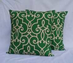
"Going Green!" - 2016 Color Trend - Emerald Green

Welcome Back Blog Readers,

Being in the wallcovering and the interior design field, I’ve been noticing recently a large amount of the color emerald green introduced in all the new designer wallpaper and fabrics. I, as a May baby, have always been partial to this color as the Emerald is my birthstone. It represents nature and is a powerful color because it makes a daring design statement. Emerald green never goes out of style, and it fuses well with almost any pastel. I have also noticed this color hue has made its way into the fall season with regards to the fashion industry; this particular shade looks well on any lady wearing this powerful and rich color. So, a suggestion; "go green" in your fashion and with your home decor.

And, as I always say, folks, “Don’t be afraid to decorate!”

Best,


Robin


Thursday, September 1, 2016

Decorating with Faux Bois

Welcome Back Blog Readers,

Lately I have been noticing in the new wallcovering collections the look of Faux Bois. Its meaning is "false wood." This rustic look seems to be quite the design trend inside the home. I find it a fabulous way of bringing the natural outside beauty into one’s living space. Thibaut, an upscale wallcovering company introduced this look in their latest collection, Texture Resource IV with a pattern called Eastwood. A varied collection of wood grain in nine different color ways. How fabulous for one wall in a family room or as an accent wall in an informal hallway!

Not only is the tree grain motif appearing in wallcovering, it appears in furniture, fabric and home accessories.

You don’t have to be a lumberjack to enjoy the idea of a Faux Bois motif. And, as I always say folks, “Don’t be afraid to decorate!”

Best,


Robin


Monday, August 8, 2016

In The Navy!

Welcome Back Blog Readers,
               
With the winding down of summer in a few weeks, I always try to hold onto my great summer experiences with some fabulous nautical elements that can carry me through the year. Maybe it’s because of my passion for sailing that I have always tried to incorporate a nautical theme, for they are a classic in the home. They can be used naturally in your family’s beach cottage, or in spots not by the ocean. For example, in a boy’s bedroom incorporating striped wallpaper or in a guest bedroom, and maybe the use of some toss pillows in a family room, paired with an interesting fabric.
               
The color navy is a great classic, that, when paired with white, makes any room crisp and clean. And did you know, the color term ‘navy’ comes from the uniforms worn by the British Navy back in the 19th century.
              
So folks, bring in a nautical theme in your decor, it’s fun, sophisticated, and brings the outside in! Enjoy the rest of the summer, and, as I always say, ‘Don’t be afraid to decorate!”

Best,

               
Robin


Monday, July 18, 2016

"Getting Trim"

Welcome Back Blog Readers,

For today’s design blog we will be talking about “getting trim.” No, folks, we will not be talking about how to get thin or your workout or weight-loss routine. We will be discussing paint color that is ideal for woodwork, chair rails and baseboards.

My choice as an interior designer and wallcovering expert has always been white; yes, just plain white! Be it an off-white or a grey white which always appears crisp and clean looking. The reason is simple. Whether you paint or wallpaper, a crisp white or off-white paint trim sets off wallcovering and any wall paint color. By using a contrasting color trim just seems to be too busy and calls attention to too many details in your living space. Also, a color trim choice will lock you in when you are choosing fabrics or floor coverings. It just simply makes the living space too busy and complicated.

White trim is a classic choice, and goes with traditional decor or a contemporary theme. If you take a look in most design magazines you will find that white trim is favored by my fellow interior designers.

So folks, if you want to keep your home up to date, choose white trim. And, as I always say, “Don’t be afraid to decorate!”

Best,

Robin


Wednesday, June 29, 2016

To Upholster or Not To Upholster...That is the Question.

Welcome Back Blog Readers,

To upholster or not to upholster? That is the question…

As an interior designer and owner of the Four Walls Wallpaper Studio, I am asked by my clients quite often, is it worthwhile to reupholster a sofa, or dining room chairs or any piece of furniture in the home for that matter. Unfortunately we are seeing more low-end furniture that is being fabricated with inferior materials, and not to mention toxic chemicals that are being applied in the seat cushion stuffing. When reupholstering a quality piece of furniture that is either one you’ve purchased through an interior designer or inherited from your family, it is in my opinion the best option to reupholster it. The reason why I feel this way, is the mere fact that the framework used is better quality and more concern is placed in the construction and quality of the wood accents used on the arms and legs of chairs and sofas. I have recently been involved in the redesign of a client’s living room where I had suggested reupholstering two Bergere chairs of excellent framework, which I like to call “good bones!” I suggested to my client to use a contemporary, hip, bohemian Ikat as the fabric choice. The end result gave my client a unique look that can’t be replicated in today’s furniture market!

So readers, when you’re visiting family and they want to give you a piece of their old furniture, don’t say no, look at it from a different design perspective. Older is sometimes better!

And, as I always say folks, “Don’t be afraid to decorate!”

Best,


Robin


Wednesday, June 1, 2016

A "Light" Subject

Welcome Back Blog Readers,

For today’s blog we will discussing LED lighting. Lighting is a design element that I have had extensive experience with in my years of interior design. It is both a commercial and home element that is most important and often overlooked by consumers. According to a recent study by the American Institute of Architects, LED lighting is leading the growth and demand for both kitchen and bathroom features in the American home. And unlike many design trends the switch to LED lighting is not slowing down any time soon, as both my colleagues and I agree.

As a matter of fact, LED sales have doubled in the last two years, and I can see why as a great number of my clients have requested that I specify energy efficient lighting to their closets, shelves in their study’s and stairways. This has been a must with the restaurant interiors that I have been involved with most recently. LED lighting has become important in outdoor spaces such as its use on decks and walkways.

Being both an interior designer and the owner of a wallcovering and fabric studio in Newton Mass, the real reason LED lighting is so important to me is the fact of the CRI/Color Rendering Index, which enhances the true color tonality of wallcoverings and fabrics. I won’t bore you on the different levels between warm and cool tones I promise! So with all these fabulous advancements with LEDs let’s shed more “light” on your world. And as I always say folks, “Don’t be afraid to decorate!”

Best,

Robin


Thursday, May 5, 2016

Robin's Design Concept for Spring 2016!

Welcome Back Blog Readers,

There’s an exciting new design feeling for Spring of 2016. This concept seems to be the trend for my clients needs. The “old design concept” was filling a room with a lot of accessories and too much over-scaled furniture. Now it’s simple, friendly and serene. The new designer fabric choices are more durable and user-friendly. That’s not to say that it sacrifices look, by any means. More linens, chenille’s, and crushed velvet blends have taken a forefront.

Window treatments have a strong emphasis on straight panels with more of a tailored edge. Roman shades have been the number one choice for my current projects. When it comes to the wallcovering, deep tones such as grays and blues, incorporating the use of grass cloth or a very high-end vinyl texture from England and Italy were favored. This concept allows my clients to utilize their personal elements such as their area rugs in the design plan. The spring colors for 2016 have been neutrals paired with jewel tones, such as grays and milky blues with purples, lilacs and corals.

Each of the interior design projects that I’ve been involved with recently have one important design philosophy; the rooms are functional, lived-in and represent my clients’ personal taste. More of the emphasis is placed on the comfort and enjoyment of the owners of the home, their family and the welcoming of their guests. In conclusion, a room should feel well-designed but not be afraid to be used, and it is my belief that the overall look should appear that the interior of the home reflect my clients personality and not my own. There is a right and wrong within a client’s taste, that has been my design standard for over thirty years. As I always say folks, “Don’t be afraid to decorate!”

Best always,

Robin