Picture Hanging

Tuesday, January 31, 2017

DESIGNING WITH LOVE

Welcome Back Blog Readers,

With Valentine’s Day only a few weeks away, today’s blog will feature the subject of designing your bedroom with your ‘sweetheart’ in mind. When I ask couples, both married or unmarried, what they are looking for in a master bedroom design they almost always tell me that they like the look of a simple master bedroom. By this they mean not busy wallpaper and the popular choice is a simple tone-on-tone geometric or an extra-fine grass cloth texture. Another request is a master bedroom that encompasses straight lined furniture and not over crowded. When it comes to the fabric for the bedding not too over-printed, simple and plain fabrics with lots of texture are the top choice. With respect to the window treatments, I like to suggest a tailored look for example, roman shades or simple panels with a stunning rod and 
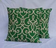
decorative finials. When selecting the area rugs almost always something with a printed geometric design is always easy to live with. An area rug with a dash of color keeps the master bedroom design interesting!

Basically, today’s master bedroom suites are always designed with a peaceful and restful existence in mind. It is my belief with today’s busy pace almost all of my clients request ‘simple yet stunning’. When this design concept is used it results in a sexy master bedroom suite. Remember… “Simple can be sexy!”

And, as I always say, “Don’t be afraid to decorate!”

Best always,


Robin


(Landry & Arcari - area rugs)


(David Hicks - wallcovering)

(Kravet - fabric)

Monday, January 9, 2017

Go With The Flow

Welcome Back Blog Readers,

Hope that everyone had a fantastic Holiday and New Years! Today, I would like to talk about a common design issue that I see all too often when I am working with my clients. This concept is the color and design flow from one room to another, as well as the colors involved in various rooms in one’s home. As an interior designer a flow in any room involves the following basic elements of design: they are naturally color, scale, texture as well as pattern and balance. Light in a room is of the utmost importance because, it can throw off color elements in any room decor. I always suggest to my clientele that the rooms should flow it should not feel disjointed and when you look from one room to another I suggest to add and drop color from room to room, so each area of the home is not repetitive. If you like a few colors, keep to them and do not add too much color, as a room can get too complicated. Remember, the colors of your home are a personal choice. Do not get swayed by living with a suggestion from a friend or even your own interior designer!

Because the homes today are built with an open floor plan this flow concept is critical to a successful interior design layout.

When the element of wallcovering is used, for instance in a hallway, it is best to continue the same pattern throughout so that you keep the space continually flowing. It you stop at the corner of a hallway and add paint as the continuing factor it will look like you ran out the wallcovering and the total look will be unfinished. Accent walls with wallcovering, are a planned application and are a fantastic design choice when used with the correct coordinating paint color.

Lastly, your fabrics and furniture selections should also have a flow. You should be able to take your dining room chair and bring it into your living room space if you’re entertaining and run out of seating. The upholstery fabric should meld into the room. Please don’t misunderstand me, “you don’t have to match your dining room to your master bedroom fabrics!” Being too matchy-matchy is not a good look either! The key is to look at the entire picture.

So remember folks, in the dictionary the definition of flow “is to have a smooth continuity.”

If you stand in the hallway of your home and the colors, fabrics, wallcovering, and scale of furniture feel to move smoothly to your eye then your home has a design flow!

So, as I always say, folks, “Don’t be afraid to decorate!”

Best Always,


Robin


(Photo courtesy of Houzz)

(Photo courtesy of Candace Olson)


Friday, December 9, 2016

Texture Wallcovering in Practical Form

Welcome Back Blog Readers,

I hope that all of you enjoyed your Thanksgiving holiday with friends and family!

Today I would like to talk about a new concept that has recently evolved with one of the wallpaper manufacturers that I have worked with over several years, York Wallcovering. I have been waiting a long time for one of my vendors to come up with a washable textured wallpaper that does not look like a dentist’s office or a hotel lobby, and they have! This new collection just arrived in my store, and is by one of my most favorite designers, Candice Olson. The name of this wallpaper collection is called Moonstruck.

A fine collection of vinyl textured wallpaper that encompasses tone-on-tone geometrics with a contemporary flair. These designs are easy to live with because they are in my opinion, timeless. Because this collection is made of a lightweight vinyl, they are washable and the seams do not panel like in a natural grass cloth wallcovering. What’s also exciting is the fact that these wallpapers are fabric backed and removes easily if you decide to change your wallpaper in the future. I’ve also found while working with my clients that this new collection coordinates with any fabric you put with it or any furniture style.

So folks, stop in and take a look! Let me clue you in, my fellow decorating aficionados, wallpaper is in, and it’s now user-friendly.

So, as I always say folks, don’t be afraid to decorate!

Best always and Happy Holidays!


Robin


Monday, November 14, 2016

Keeping Your Holidays Simple and Elegant

Welcome Back Blog Readers,

The Holiday Season is upon us. As we all know, it’s important to be organized and have a nice presentation of your home for family and guests. The mood is everything. Here is my personal outline for getting ready for the Holidays.

First is the guest room. I find it is most important to replace mismatched bedding, update with new pillows and add welcoming cozy comforters. A few simple touches is all it takes to make your guests feel part of your home.

Next on my outline is the guest bathroom. Change out the towels with fluffy white ones for a spa-like feeling. Then add scented soaps and candles to create a welcoming atmosphere.

Another highlight should be your family table. The best place to start is with the tableware and place settings; I always like to start with white china as it’s a simple touch and enhances the presentation of the food. Add in some inherited crystal or silver serving pieces that have been passed down through the generations. It will add to the history and fine memories of loved ones that are no longer with you.

The Holidays are about coming together, and nothing says that more than your home during this season. With a little love and attention, you’ll set the stage just right and memories will be made.

Enjoy your Holidays, and as I always say, “Don’t be afraid to decorate!

Best,


Robin 


Thursday, October 20, 2016

My Day at The Boston Design Center

Welcome Back Blog Readers,

My day at The Boston Design Center where I visited the new Cowtan & Tout showroom and had the opportunity to view all the new, exciting fabric and wallcovering collections! Visit The Four Walls to inspire your pre-holiday home redesign.


"It's a great day" at the Phillip Jeffries showroom visiting my dear friend Jill. The selection of the grasscloth and texture wallcovering was quite impressive for the upcoming season!


Wednesday, September 28, 2016

"Going Green!" - 2016 Color Trend - Emerald Green

Welcome Back Blog Readers,

Being in the wallcovering and the interior design field, I’ve been noticing recently a large amount of the color emerald green introduced in all the new designer wallpaper and fabrics. I, as a May baby, have always been partial to this color as the Emerald is my birthstone. It represents nature and is a powerful color because it makes a daring design statement. Emerald green never goes out of style, and it fuses well with almost any pastel. I have also noticed this color hue has made its way into the fall season with regards to the fashion industry; this particular shade looks well on any lady wearing this powerful and rich color. So, a suggestion; "go green" in your fashion and with your home decor.

And, as I always say, folks, “Don’t be afraid to decorate!”

Best,


Robin


Thursday, September 1, 2016

Decorating with Faux Bois

Welcome Back Blog Readers,

Lately I have been noticing in the new wallcovering collections the look of Faux Bois. Its meaning is "false wood." This rustic look seems to be quite the design trend inside the home. I find it a fabulous way of bringing the natural outside beauty into one’s living space. Thibaut, an upscale wallcovering company introduced this look in their latest collection, Texture Resource IV with a pattern called Eastwood. A varied collection of wood grain in nine different color ways. How fabulous for one wall in a family room or as an accent wall in an informal hallway!

Not only is the tree grain motif appearing in wallcovering, it appears in furniture, fabric and home accessories.

You don’t have to be a lumberjack to enjoy the idea of a Faux Bois motif. And, as I always say folks, “Don’t be afraid to decorate!”

Best,


Robin